Appearance
Typography
Lumevia uses two fonts: a heading font for the heading that leads each section or page, and a body font for everything else: paragraphs, product titles, prices, buttons and menus.
Open it from Theme settings (the gear icon at the top left of the editor) → Typography.
Headings
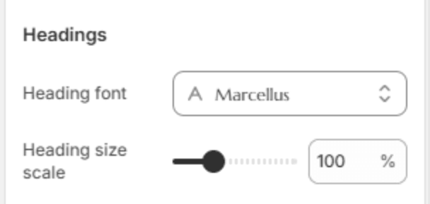
| Setting | Description |
|---|---|
| Heading font | The font for headings. The font picker also sets the weight, and headings use exactly the weight you choose there. |
| Heading size scale | Makes every heading larger or smaller at once (80–150%). Headings also step down smoothly on smaller screens, so a phone gets a smaller size than a desktop at the same setting. |
Body
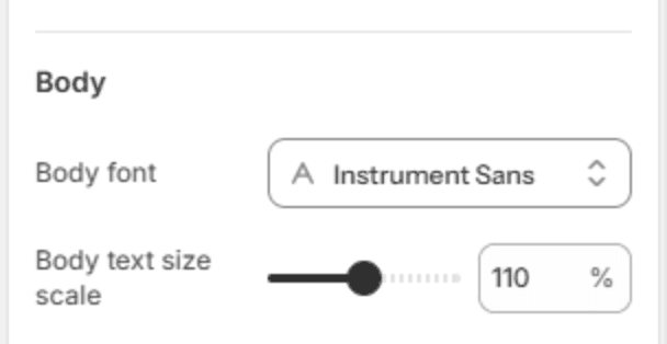
| Setting | Description |
|---|---|
| Body font | The font for text, menus, prices and buttons. Body text uses the weight you choose, and the font's bold weight for emphasis. |
| Body text size scale | The size of body text (90–130%). At the default 110%, text is 17.6px on a desktop. Tablets get 91% of that and phones 85%, so the store reads comfortably on each screen. |
Note
Fonts come from Shopify's font library, which is free to use and is served by Shopify's own fast servers. Fonts you upload yourself are not available in the font picker.
Note
A few sections have a Heading font setting with Display and Body. Display uses the heading font from this page, Body the body font, for when a heading should read more like text.