Appearance
Layout
These settings shape every page: how wide the content runs, how much air sits between sections, and how round the corners are.
Open it from Theme settings (the gear icon at the top left of the editor) → Layout.
General
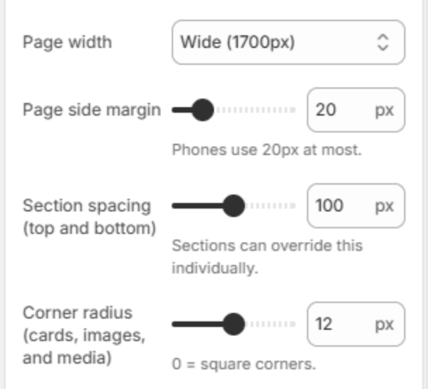
| Setting | Description |
|---|---|
| Page width | The widest the content may run: Narrow (1440px), Standard (1600px) or Wide (1700px). On a larger screen the content stays centered at this width. Sections with Full width turned on ignore it, up to 2560px: on a wider screen the whole page stops growing and stays centered. |
| Page side margin | The space between the content and the edge of the screen (10–60px). Phones use 20px at most, so a wide margin never squeezes the content on a small screen. |
| Section spacing (top and bottom) | The space above and below each section (0–200px). Tablets get 80% of it and phones 60%. A section can set its own spacing with Use custom spacing. |
| Corner radius (cards, images, and media) | How round the corners of cards, images and videos are (0–24px). 0 gives square corners. |
Store policy pages
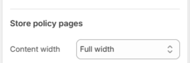
| Setting | Description |
|---|---|
| Content width | How wide the text runs on your policy pages (refund, privacy, terms of service, shipping and contact information): Narrow, Medium, Wide or Full width. |
Note
Policy pages are written in the Shopify admin under Settings → Policies. Lumevia gives them the page banner, breadcrumb and spacing of the rest of the store.