Appearance
Lookbook
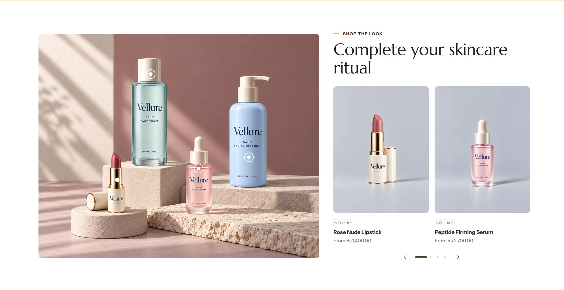
The lookbook turns a photo into a shop: small dots, called hotspots, mark the products in the picture, and a carousel of product cards sits beside it. Clicking a dot brings that product's card into view, ready to add to the cart. A hotspot can also open a short text instead of a product.
Find it in the editor
On the home page, it is in the Template list. To add it to any page, click Add section and choose Lookbook. Each hotspot is a Product or Text block inside it.
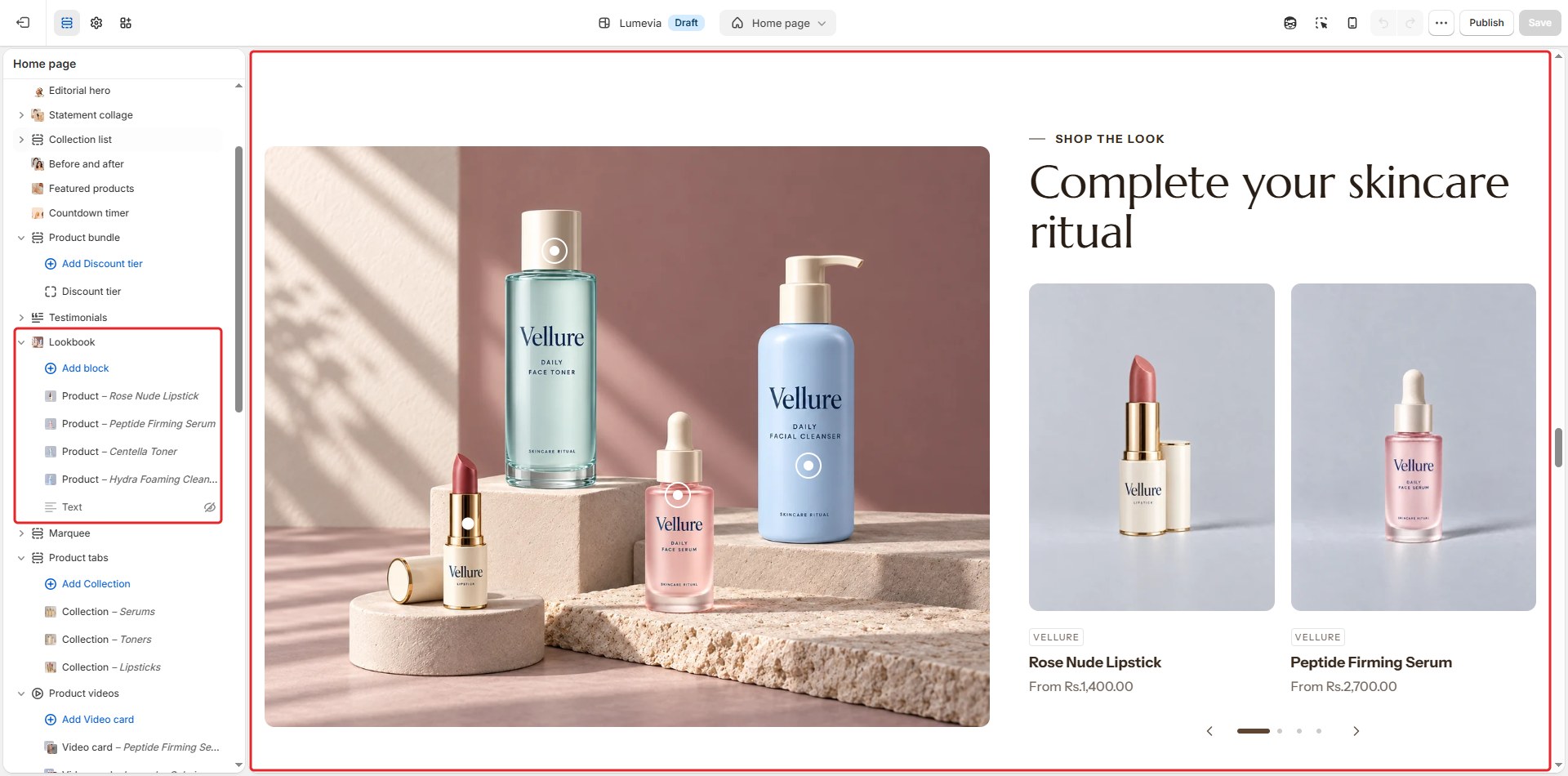
Section settings
General
| Setting | Description |
|---|---|
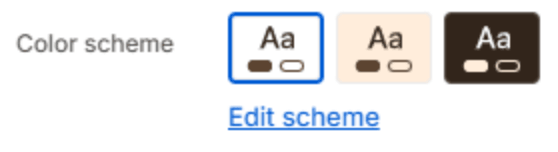
| Color scheme | The colors of this section. Schemes are edited in Theme settings → Colors. |
Layout

| Setting | Description |
|---|---|
| Image side | Puts the photo on the Left or Right of the products. On a phone the photo comes first. |
Section header
| Setting | Description |
|---|---|
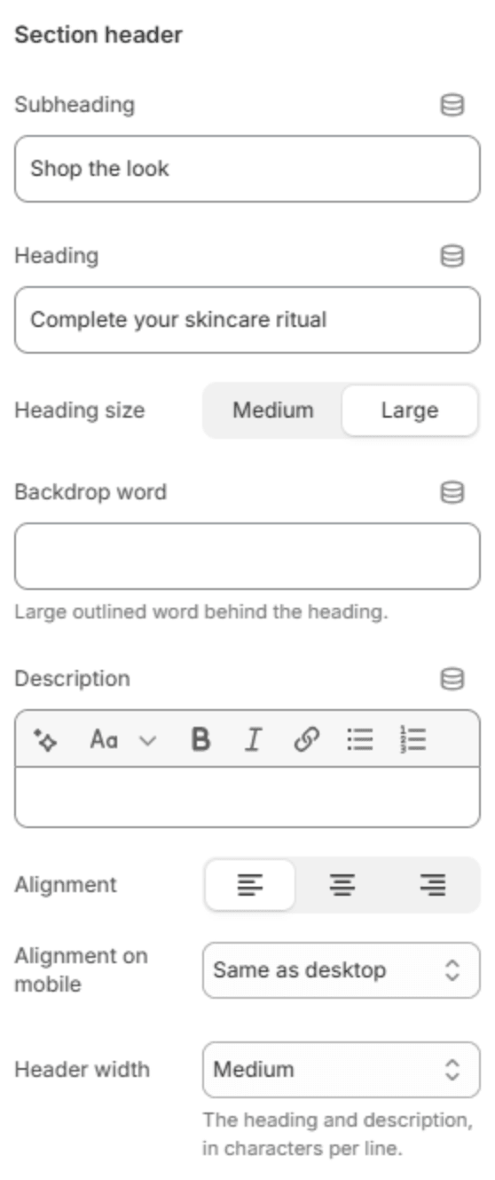
| Subheading | A short line above the heading, with a small dash beside it. |
| Heading | The heading. Leave it empty to hide it. |
| Heading size | Medium or Large. Shown when the heading has text. |
| Backdrop word | A large outlined word behind the heading. One short word works best; it sizes itself to fit. |
| Description | A short text under the heading. |
| Alignment | Aligns the header to the left, center or right. |
| Alignment on mobile | The alignment below 768px. Same as desktop keeps the alignment above. |
| Header width | How wide the heading and description may run: Narrow, Medium, Wide or Full width. |
Photo

| Setting | Description |
|---|---|
| Image | The photo with your products in it. |
| Phone photo | A separate photo for phones, for example a closer crop. With one set, each hotspot gets a second position for phones. |
| Image ratio | The photo's shape: Adapt to photo, Landscape, Square or Portrait. The shape stays the same on every screen, so the hotspots stay on their products. |
| Corners | Arch rounds the top into an arch; Rounded and Square set the corners. |
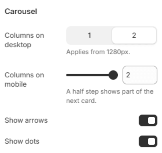
Carousel
| Setting | Description |
|---|---|
| Columns on desktop | How many product cards show beside the photo from 1280px: 1 or 2. |
| Columns on mobile | How many cards fit across a phone (1–2). A half step shows part of the next card. |
| Show arrows | Shows the previous and next arrows. |
| Show dots | Shows a row of dots under the carousel, one for each position. |
Section spacing

| Setting | Description |
|---|---|
| Use custom spacing | Gives this section its own top and bottom spacing. Off, it uses Section spacing from Theme settings → Layout. |
| Top spacing | Space above the section (0–200px). Phones get 60% of it and tablets 80%. Shown when Use custom spacing is on. |
| Bottom spacing | Space below the section (0–200px). Phones get 60% of it and tablets 80%. Shown when Use custom spacing is on. |
Blocks
Each block is one hotspot on the photo. Add them with Add block under the section in the sidebar.
Product
A hotspot for a product. Its card appears in the carousel.
General

| Setting | Description |
|---|---|
| Product | The product in the photo. |
Hotspot
| Setting | Description |
|---|---|
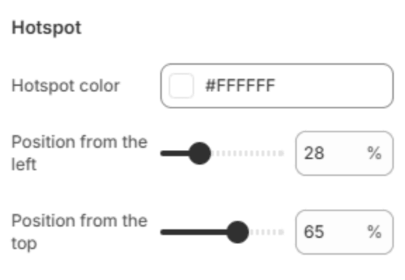
| Hotspot color | The dot's color. Pick one that stands out on this part of the photo. |
| Position from the left | Where the dot sits across the photo (0–100%). |
| Position from the top | Where the dot sits down the photo (0–100%). |
| Phone: from the left | The dot's position across the phone photo (0–100%). Shown when a phone photo is set. |
| Phone: from the top | The dot's position down the phone photo (0–100%). Shown when a phone photo is set. |
Text
A hotspot that opens a short text, for example how the products are used.
General

| Setting | Description |
|---|---|
| Heading | The text's heading. |
| Text | A line or two. |
| Link | An optional link. |
| Link label | The link's text. |
Hotspot
The same position settings as a product hotspot: Hotspot color, Position from the left, Position from the top, and the two phone positions.
Note
Placing a hotspot: select its block, then move the two position sliders while you watch the dot in the preview. 50% and 50% is the center of the photo.