Appearance
404 page
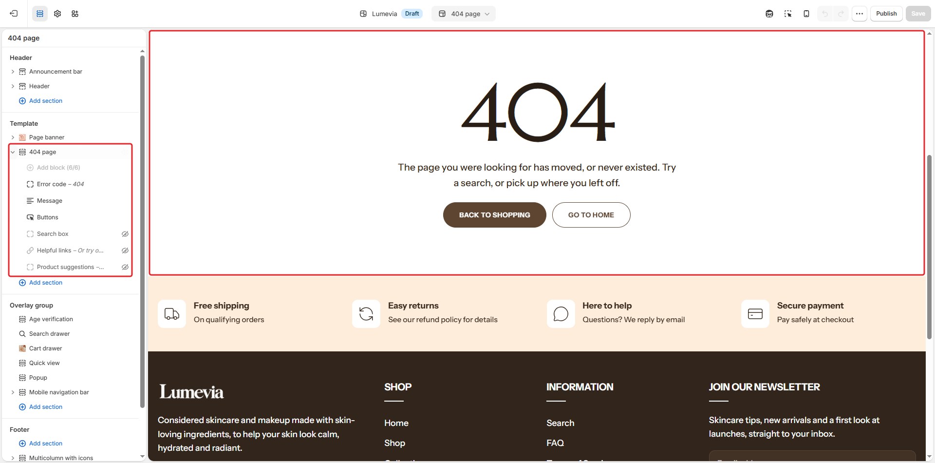
The 404 page appears when a customer follows a link to a page that doesn't exist. Instead of a dead end, it offers a way back: a large error code, a short message, a search box, buttons, helpful links and a few products.

To open it in the editor, choose 404 page from the page menu at the top of the editor. A Page banner sits above the 404 page section, whose parts are blocks.
Section settings
| Setting | Description |
|---|---|
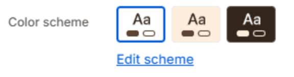
| Color scheme | The colors of this section. Schemes are edited in Theme settings → Colors. |
Layout

| Setting | Description |
|---|---|
| Full width | Lets the section use the full width of the screen instead of the page width. |
Section spacing
| Setting | Description |
|---|---|
| Use custom spacing | Gives this section its own top and bottom spacing. Off, it uses Section spacing from Theme settings → Layout. |
| Top spacing | Space above the section (0–200px). Phones get 60% of it and tablets 80%. Shown when Use custom spacing is on. |
| Bottom spacing | Space below the section (0–200px). Phones get 60% of it and tablets 80%. Shown when Use custom spacing is on. |
Blocks
Add blocks with Add block under 404 page in the sidebar, and drag them into order. Each can be added once.
Error code

| Setting | Description |
|---|---|
| Text | The large number, usually 404. |
| Style | Solid or Outline letters. |
| Size | How large it is, as a share of the theme's heading size (100–400%). |
Message

| Setting | Description |
|---|---|
| Text | A short, friendly message. Leave it empty to use the theme's own wording, which follows your store's language. |
Search box
| Setting | Description |
|---|---|
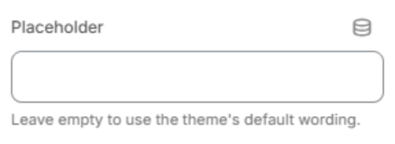
| Placeholder | The hint inside the empty box. Leave it empty to use the theme's own wording. |
Buttons
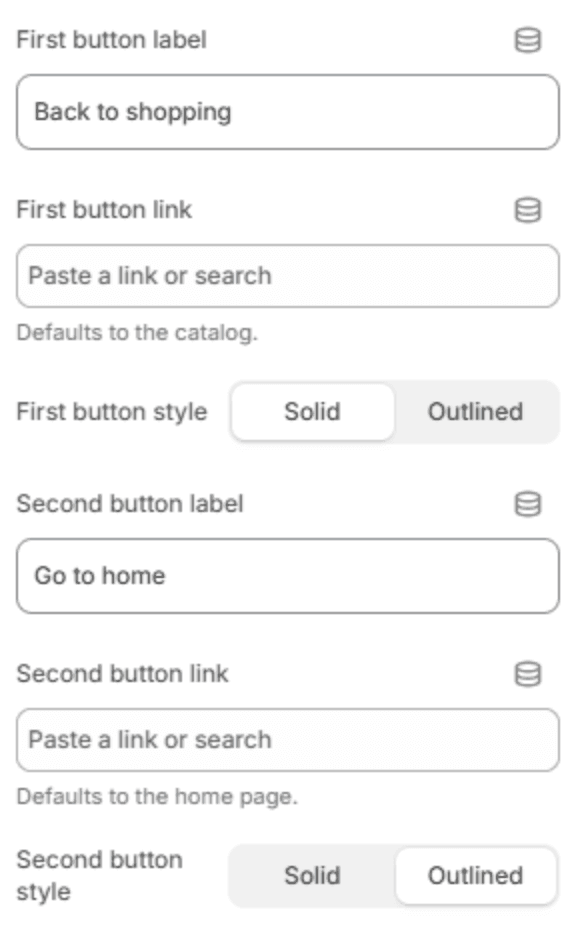
| Setting | Description |
|---|---|
| First button label | The first button's text, for example Back to shopping. |
| First button link | Where it goes. Leave it empty to open your catalog. Shown when it has a label. |
| First button style | Solid or Outlined. Shown when it has a label. |
| Second button label | The second button's text. Leave it empty to hide it. |
| Second button link | Where it goes. Leave it empty to open the home page. Shown when it has a label. |
| Second button style | Solid or Outlined. Shown when it has a label. |
Helpful links
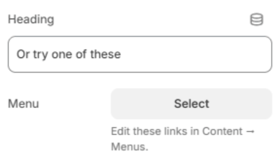
| Setting | Description |
|---|---|
| Heading | The heading above the links. |
| Menu | The menu whose links are listed, for example your main categories. Menus are edited in the Shopify admin under Content → Menus. |
Product suggestions

| Setting | Description |
|---|---|
| Heading | The heading above the products. |
| Collection | The collection to suggest from. Leave it empty to show products from your whole catalog. |
| Products to show | How many products to show (2–12). |
| Columns on desktop | How many fit in a row on a large screen (2–5). |