Appearance
Related posts
Related posts closes each article with a few more to read: posts that share a tag with the one the customer just read. When none do, it shows the latest posts from the same blog.
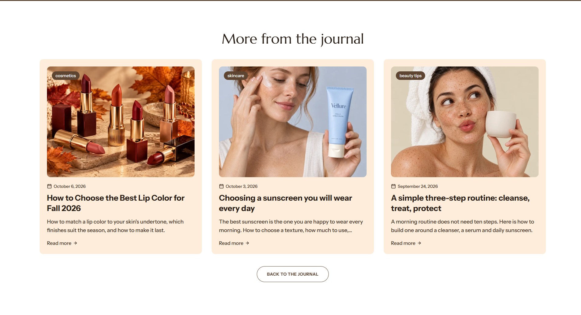
Find it in the editor
Open a blog post in the editor (the page menu at the top, Blog posts → Default blog post). Related posts is in the Template list, under the article. It can be added to blog post templates only.

Section settings
General
| Setting | Description |
|---|---|
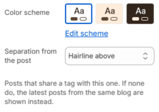
| Color scheme | The colors of this section. Schemes are edited in Theme settings → Colors. |
| Separation from the post | A Hairline above the section, to separate it from the article, or Nothing. |
Section header

| Setting | Description |
|---|---|
| Subheading | A short line above the heading, with a small dash beside it. |
| Heading | The heading. Leave it empty to hide it. |
| Heading size | Medium or Large. Shown when the heading has text. |
| Backdrop word | A large outlined word behind the heading. One short word works best; it sizes itself to fit. |
| Description | A short text under the heading. |
| Alignment | Aligns the header to the left, center or right. |
| Alignment on mobile | The alignment below 768px. Same as desktop keeps the alignment above. |
| Header width | How wide the heading and description may run: Narrow, Medium, Wide or Full width. |
Layout
| Setting | Description |
|---|---|
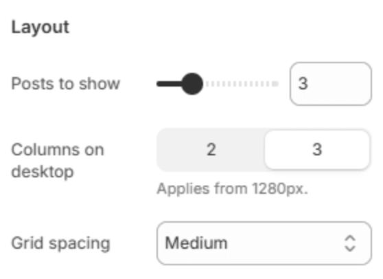
| Posts to show | How many posts to show (2–6). |
| Columns on desktop | 2 or 3 cards in a row, from 1280px. |
| Grid spacing | The space between cards: Small, Medium or Large. |
Card

| Setting | Description |
|---|---|
| Card style | Card sets each post on a raised surface; Minimal places it straight on the section background. |
| Image ratio | Landscape (4:3), Square (1:1) or Portrait (3:4). |
| Alignment | Lines the card's text up on the Left or in the Center. |
| Show tag badge | Shows the article's first tag as a badge on its picture. |
| Tag badge background | The badge's color. Leave it blank to use the color scheme. Shown when the badge is on. |
| Tag badge text | The badge's text color. Shown when the badge is on. |
| Show date | Shows when the article was published. |
| Show excerpt | Shows the start of the article, or its summary if it has one. |
| Excerpt length | Short, Medium or Long. Shown when the excerpt is on. |
| Show "Read more" link | Adds a "Read more" link to each card. |
| "Read more" label | The link's text. Shown when the link is on. |
Button
| Setting | Description |
|---|---|
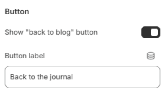
| Show "back to blog" button | Adds a button under the cards that opens the blog. |
| Button label | The button's text. Shown when the button is on. |
Section spacing

| Setting | Description |
|---|---|
| Use custom spacing | Gives this section its own top and bottom spacing. Off, it uses Section spacing from Theme settings → Layout. |
| Top spacing | Space above the section (0–200px). Phones get 60% of it and tablets 80%. Shown when Use custom spacing is on. |
| Bottom spacing | Space below the section (0–200px). Phones get 60% of it and tablets 80%. Shown when Use custom spacing is on. |
Note
Tag your articles in the Shopify admin (Content → Blog posts, the Tags card). Posts that share tags then point to each other.