Appearance
Colors
Lumevia colors the store with color schemes. A scheme is a full set of colors: background, text, headings, borders, buttons and so on. Every section has a Color scheme setting, so you design a few schemes once and then pick one per section. Change a scheme and every section that uses it follows.
Lumevia ships with three schemes: Scheme 1 on white, Scheme 2 on a warm nude and Scheme 3 on a dark brown. You can edit them, and add more.
Open it from Theme settings (the gear icon at the top left of the editor) → Colors.
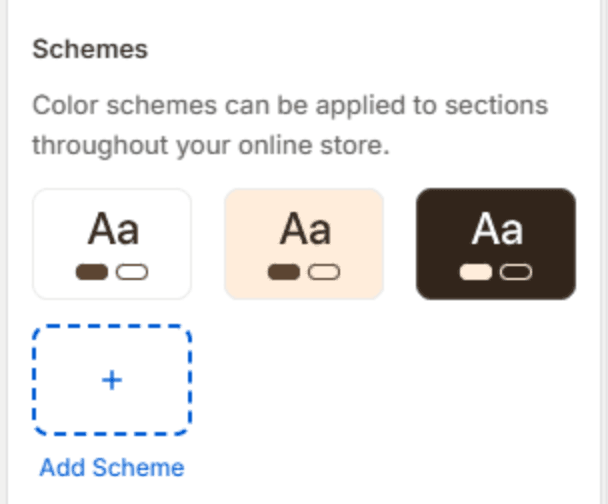
Edit a scheme
Click a scheme to open its colors. The colors are grouped the same way in every scheme.
Brand
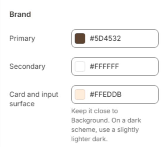
| Setting | Description |
|---|---|
| Primary | The scheme's action color: highlights such as active slider dots, selected tabs and options, progress bars and focus outlines. On a dark scheme it has to be light. |
| Secondary | The color of text and icons that sit on Primary. Keep it easy to read against Primary. |
| Card and input surface | Raised surfaces: product and blog cards, form fields, chips and panels. Keep it a near neighbor of Background. On a dark scheme, use a slightly lighter dark, not a light color. |
Base
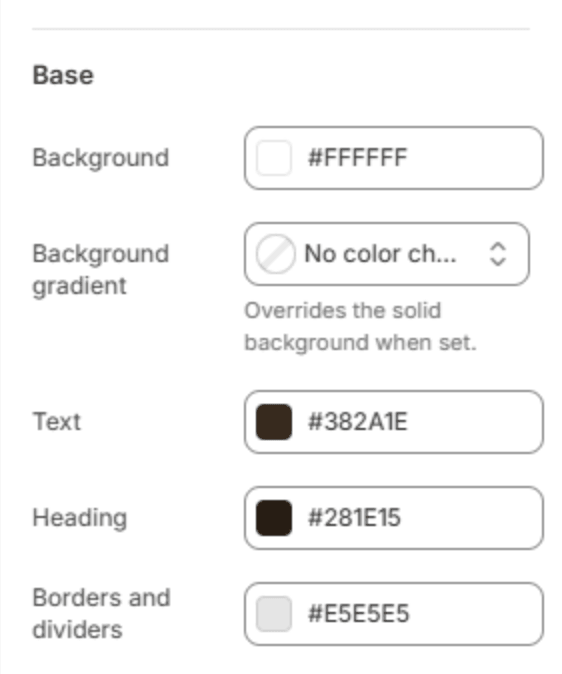
| Setting | Description |
|---|---|
| Background | The section's background. |
| Background gradient | A gradient in place of the solid background. Leave it empty to use Background. |
| Text | Body text. It must be easy to read on both Background and Card and input surface. |
| Heading | The heading that leads each section or page. |
| Borders and dividers | Thin lines: card and field borders, dividers and outlines. Choose a color that is visible but quiet. |
Accent
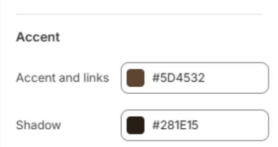
| Setting | Description |
|---|---|
| Accent and links | The color of links inside text you write in the editor or the admin: product descriptions, blog posts, pages and rich text. |
| Shadow | The color of shadows and of the dimmed backdrop behind drawers and popups. Use the scheme's darkest color. |
Primary button
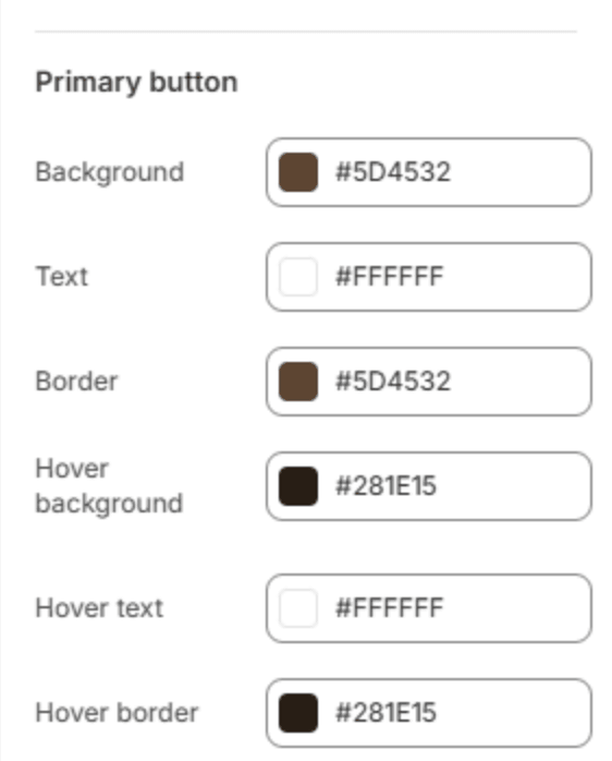
The filled button, used for the main action, such as Add to cart.
| Setting | Description |
|---|---|
| Background | The button's fill. |
| Text | The label on the button. |
| Border | The button's outline. Use the fill color for a button without a visible border. |
| Hover background | The fill when the pointer is on the button. |
| Hover text | The label when the pointer is on the button. |
| Hover border | The outline when the pointer is on the button. |
Secondary button (outline)

The outlined button, used next to a primary button or on its own for a quieter action.
| Setting | Description |
|---|---|
| Text | The label. |
| Border | The button's outline. |
| Hover background | The fill when the pointer is on the button. |
| Hover text | The label when the pointer is on the button. |
Keep text readable
Text that is hard to read costs sales and fails accessibility checks. When you edit a scheme, check these pairs:
| Pair | Should be at least |
|---|---|
| Text on Background, and on Card and input surface | 4.5:1 |
| Heading on Background | 3:1 |
| Primary on Background | 3:1 |
| Secondary on Primary | 4.5:1 |
| Primary button Text on its Background | 4.5:1 |
Any online contrast checker gives you the ratio for two colors.
Important
Card and input surface is the color people most often get wrong. It is the surface a card sits on in this scheme, not a lighter version of your brand color. On a dark scheme, a light surface puts white text on a near-white card.
Note
A few colors live outside the schemes on purpose, because they must look the same everywhere: the sale badge (Theme settings → Badges), the rating stars (Theme settings → Product cards), and the overlay color on images, which is set in each section with an image.