Appearance
Media banner
The media banner shows one large image or video with a heading, text and buttons on top. As the customer scrolls to it, it starts slightly smaller and grows to its full size, so it arrives like a reveal. Lumevia uses it on the product page to show the product in use.

Find it in the editor
On the product page, it is in the Template list. To add it to any page, click Add section and choose Media banner.

Section settings
General
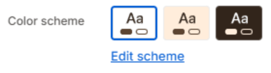
| Setting | Description |
|---|---|
| Color scheme | The colors of this section. Schemes are edited in Theme settings → Colors. |
Media

| Setting | Description |
|---|---|
| Image | The picture. |
| Mobile image | A separate picture for phones. Leave it blank to crop the desktop image. |
| Video | A video uploaded to Shopify. It plays muted and on a loop, and replaces the image. |
| Play and pause button | Adds a button that lets customers pause the video. Shown when a video is chosen. |
| Overlay opacity | Darkens the image or video so the text stays readable (0–90%). Shown when an image or video is chosen. |
Scroll zoom

| Setting | Description |
|---|---|
| Zoom in on scroll | The banner grows from a smaller size to its full size as it scrolls into view. |
| Start size | The size it starts at, compared with its full size (50–100%). 100% shows no zoom. Shown when Zoom in on scroll is on. |
Layout
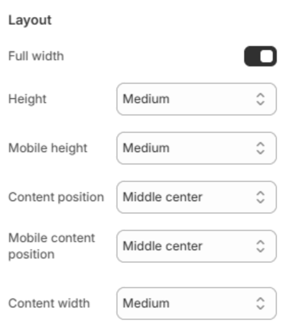
| Setting | Description |
|---|---|
| Full width | Runs the banner from edge to edge instead of within the page width. |
| Height | How tall the banner is on a large screen: Small, Medium, Large, or Fill screen. |
| Mobile height | How tall it is on a phone. |
| Content position | Where the text sits on a large screen, in a three-by-three grid from Top left to Bottom right. The text alignment follows the position. |
| Mobile content position | Where the text sits on a phone. |
| Content width | How wide the text may run: Narrow, Medium or Wide. |
Content
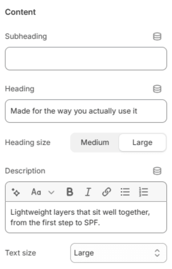
| Setting | Description |
|---|---|
| Subheading | A short line above the heading. |
| Heading | The banner's heading. Leave it empty to hide it. |
| Heading size | Medium or Large. Shown when the heading has text. |
| Description | A short text under the heading. |
| Text size | Small, Medium or Large. Shown when the description has text. |
Buttons

| Setting | Description |
|---|---|
| Button label | The first button's text. Leave it empty to hide the button. |
| Button link | The page it opens. Shown when it has a label. |
| Button style | Solid or Outlined. Shown when it has a label. |
| Second button label | The second button's text. Leave it empty to hide it. |
| Second button link | The page it opens. Shown when it has a label. |
| Second button style | Solid or Outlined. Shown when it has a label. |
Section spacing
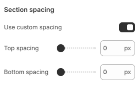
| Setting | Description |
|---|---|
| Use custom spacing | Gives this section its own top and bottom spacing. Off, it uses Section spacing from Theme settings → Layout. |
| Top spacing | Space above the section (0–200px). Phones get 60% of it and tablets 80%. Shown when Use custom spacing is on. |
| Bottom spacing | Space below the section (0–200px). Phones get 60% of it and tablets 80%. Shown when Use custom spacing is on. |
Note
Keep background videos short and light: 10 to 20 seconds is plenty for a loop, and a smaller file makes the page load faster, especially on phones.